A New Logo for a New Project. The Mystery Drop Team Invited Us to Capture Their Passion
The Creative Process and Meaning of Colors in Developing the Mystery Drop Visual Identity

When a passion for premium coffee and olive oil meets creativity and professionalism, the result is a new chapter for the Mystery Drop brand. The Mystery Drop team approached us with a challenge: to create a visual identity that would perfectly convey their dedication to premium consumption, as well as their passion for every detail of their products.
The Creative Process Behind the Mystery Drop Logo
Designing the logo for Mystery Drop was a process full of inspiration, research, and deep thought. Our team spent many hours in intense discussions with the client, striving to understand not just the business goals, but also the emotions, rituals, and philosophy behind each of their products. At Mystery Drop, coffee and olive oil are not just commodities—they are synonymous with unique experiences, moments of pleasure, and luxury that turn everyday routines into something magical and memorable.
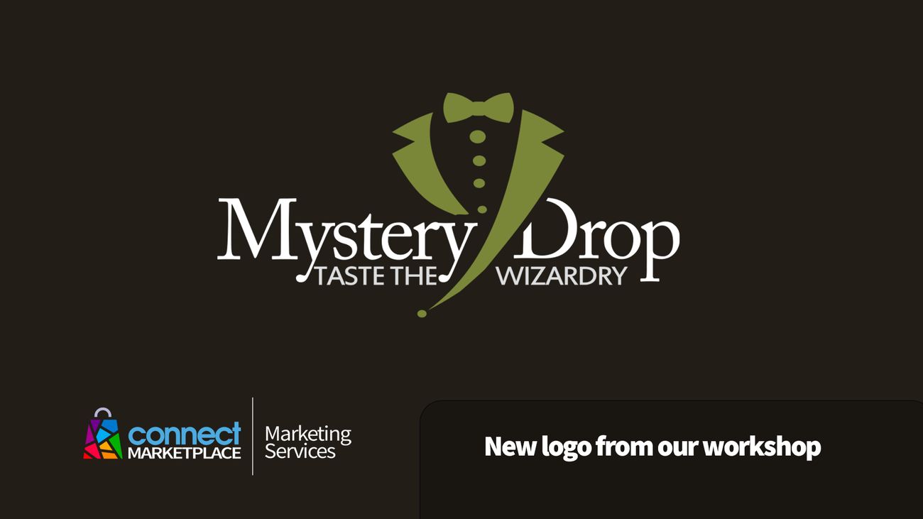
From the outset, we knew that the visual identity needed to communicate elegance, sophistication, and a touch of mystery. In collaboration with the client, we chose the motif of a blazer and bow tie—international symbols of style, top service, and special occasions. The silhouette was carefully crafted to appear dynamic yet simple, ensuring that the logo remains recognizable even at the smallest sizes or across various digital channels.
We paid special attention to color selection. Dark brown and olive green perfectly represent the core products of the Mystery Drop assortment—coffee and olive oil. Dark brown evokes warmth, strength, and reliability, while olive green brings a sense of freshness, naturalness, and luxury. This color combination was not chosen by chance; it creates a balance between traditional and modern, simplicity and exclusivity. At the same time, this harmony of colors ensures the visual identity can be used on various materials and platforms without losing its impact or appeal.
The logo’s lines are clean, clear, and minimalist, contributing to a modern impression while allowing flexibility for future projects or brand extensions. Our goal was to create an identity that isn’t limited to just one product, but can grow with Mystery Drop through all their future creative endeavors.
All these elements are merged into a visual story that is not only aesthetically pleasing, but also authentically communicates the values and mission of the Mystery Drop brand—sophistication, enjoyment, and the magic of every sip or drop.
The Logo as the Beginning of a New Project
Launching a new visual identity for Mystery Drop also marks the beginning of a new project that, we’re certain, will open many eyes to the pleasures of premium coffee and olive oil. This logo is not just a mark on packaging—it’s an invitation to an experience, to try something new, and to discover a world of flavors with just the right dose of mystery and magic.
Our Mission: Giving Brands Wings to Grow
We are proud to have had the opportunity to work with the Mystery Drop team and be a part of their story. Every new logo from our creative studio is more than just a graphic solution—it’s the result of deep understanding of the client’s needs, market, and values. We believe that the Mystery Drop visual identity will bring the brand greater visibility, recognition, and added value in the premium products market.
If you too are looking for a unique and professional visual identity for your brand, our Connect Marketplace Marketing Services team is at your disposal!


